


Low Earth Orbit (LEO) satellites are shaking up inflight connectivity. Since launching SpaceX’s Starlink service in aviation, JSX has been wowing passengers with blazing fast Internet on board its ERJs. OneWeb’s LEO constellation, meanwhile, is readying to support IFC in 2024, with Intelsat, Hughes and Panasonic Avionics set to serve as distribution partners in the commercial sector. Demos of OneWeb’s service, including at the recent Aircraft Interiors Expo (AIX), have yielded impressive results.
So how does the quality of experience (QoE) of LEO satellite-powered inflight connectivity compare with GEO-supported IFC? NetForecast, which measures and assesses the real end-to-end Internet user experience, including on board aircraft, decided to find out. With its QMap app installed on the mobile devices of airline crew members, NetForecast employees, and other interested parties, the Charlottesville, Virginia-based company captured end-to-end latency, packet loss, DNS lookup time, and effective bandwidth data on a total 155 flights, calculating QoE scores for each flight as well as for six user application categories using a zero-to-one scale.
“We’ve now reached critical mass to be able to share our LEO versus GEO quality of experience performance data,” NetForecast president Rebecca Wetzel told RGN at AIX. “This is a passenger experience comparison between the LEO flights, of which we had 62, and 93 GEO flights. The GEO flights are all different airlines and different service providers. It’s a mélange. The LEOs, well… [there’s only one active provider at present.]
“So, we calculated Apdex* (Application Performance Index) scores for LEO versus GEO and we level set our calculations so we could compare the services to each other. When we compare GEOs to each other, we set performance thresholds to reflect baseline values based on what GEO can deliver.”
If an airline offered only GEO-based IFC, but had multiple different service providers, the scoring would compare the services equally. “We level set to compare apples to apples,” explained Wetzel. “In the case of our GEO versus LEO comparison, we averaged the scores for all of the GEO flights together and all of the LEO flights.”
The results put the average flight QoE for GEO in a “fair” category whereas LEO had an average in the B+ “good” range.

NetForecast used the highly regarded standard Apdex* scale, which is a zero to one scale. Image: NetForecast
Observing the “huge gap” in performance of 0.11, NetForecast director of business development Mary Rogozinski told RGN: “So, in our testing, at some airlines you’re seeing GEOs down at the bottom end. There are flights out there that are very poor.” [Note: Beyond entering a flight number and starting the app, there is no interaction by the crew or employees.]
NetForecast set Apdex thresholds differently depending on what kind of application is being used, identifying six application categories: Interactive, Message, Cloud Service, File Transfer, Streaming, and Social Media.
“Each of the categories has a different set of requirements from the network in order to deliver a good quality of experience to the user. And so, we compared the different application categories with the GEOs and with the LEOs,” said Wetzel. “And as you can see, depending on what you’re trying to do, if you’re doing messaging, it’s not such a big difference. But if you’re doing something interactive or streaming, then there’s a big difference in the scores.”

Image: NetForecast
The LEOs outperformed the GEOs for every application category, which is perhaps not surprising.
“But there’s more to talk about,” said Wetzel. “I asked our data analysts for a view into the underlying data. It’s most important to look at the differences between GEO and LEO, and the two most important areas of difference are latency and service interruption time. You can see that, for the LEOs, the average latency was down around 170 milliseconds, and for the GEOs, it was up around 775 milliseconds. So, the GEO latency is about 4 1/2 times higher than the latency of the LEO flights.”
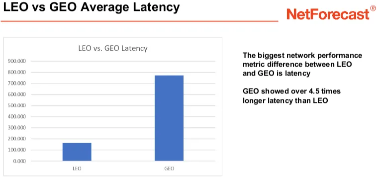
Image: NetForecast
“Then there are the service interruptions,” she continued. “This is really interesting because service interruption time is very, very, very important since it just stops you in your tracks. For latency, some applications choke but others can keep going; it may just take longer. You don’t see service interruptions very often on the ground, but we found that when we started to look at the passenger experience, there are a lot of service interruptions, especially with geosynchronous services.
“We have seen differences among service providers, but on average GEO flights experienced 10.33 percent of flight time in service interruptions, while LEO flights averaged only 1.20 percent of flight time in service interruptions. GEO flights spent on average 8.6 times more flight time in service interruptions than the LEO flights we measured.”
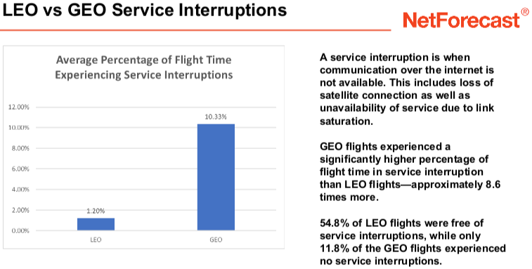
54.8% of LEO flights experienced ‘no service interruptions’, compared to only 11.8% of the GEO flights. Image: NetForecast
On GEO IFC-fitted aircraft that have been recently upgraded (such as with new modem technology), there were fewer service interruptions. “I think there are so many older legacy systems out there that are much more susceptible to these interruptions. And as they all go through their different upgrades, I expect that their QoE scores will improve,” said Rogozinski.

Appreciating that the GEO average is based on a ‘stew’ of IFC service providers versus just a single active provider in LEO, i.e. SpaceX, and that JSX’s ERJ flights, which are largely in CONUS, are shorter than many GEO IFC-fitted aircraft (JSX presently has a three-hour flight time limit) … NetForecast’s initial assessment of the LEO versus GEO quality of experience nonetheless offers some compelling food for thought.
*Apdex is an industry standard method to report users’ satisfaction with the response time of an application given an appropriate set of measurement samples. Users are satisfied with performance below a preset threshold T and tolerating performance above T. Frustrating experience occurs above a second threshold F. Sum the number of samples in each performance range where the satisfied count gets full credit, tolerate count gets half credit and the frustrating count gets no credit. Then divide by the total number of samples to yield the zero-to-one Apdex score.
Related Articles:
- How NetForecast is measuring Wi-Fi PaxEx virtually in the seat
- SpaceX teases disruption with frictionless Wi-Fi
- Hughes eyes direct IFC approach with LEO-, GEO- and multi-band hybrid
- ThinKom Ka2517 in the home stretch for linefit offerability
- Boeing eyes IFC provision tweaks to facilitate Stellar Blu ESA
- OneWeb postpones inflight connectivity service launch to early 2024
- Seamless details work with GSMA to support frictionless inflight Wi-Fi
- JSX fits entire fleet with Starlink inflight connectivity