


 If you think of design-focussed airlines, TAP Air Portugal might not be the first to come to mind. But the Portuguese national carrier, which is known for its Latin America to Europe network and cheap North American transatlantic flights over its Lisbon hub, certainly has an impressive history. And in terms of soft product, TAP teams with upmarket home country brands to make its premium #PaxEx feel properly premium.
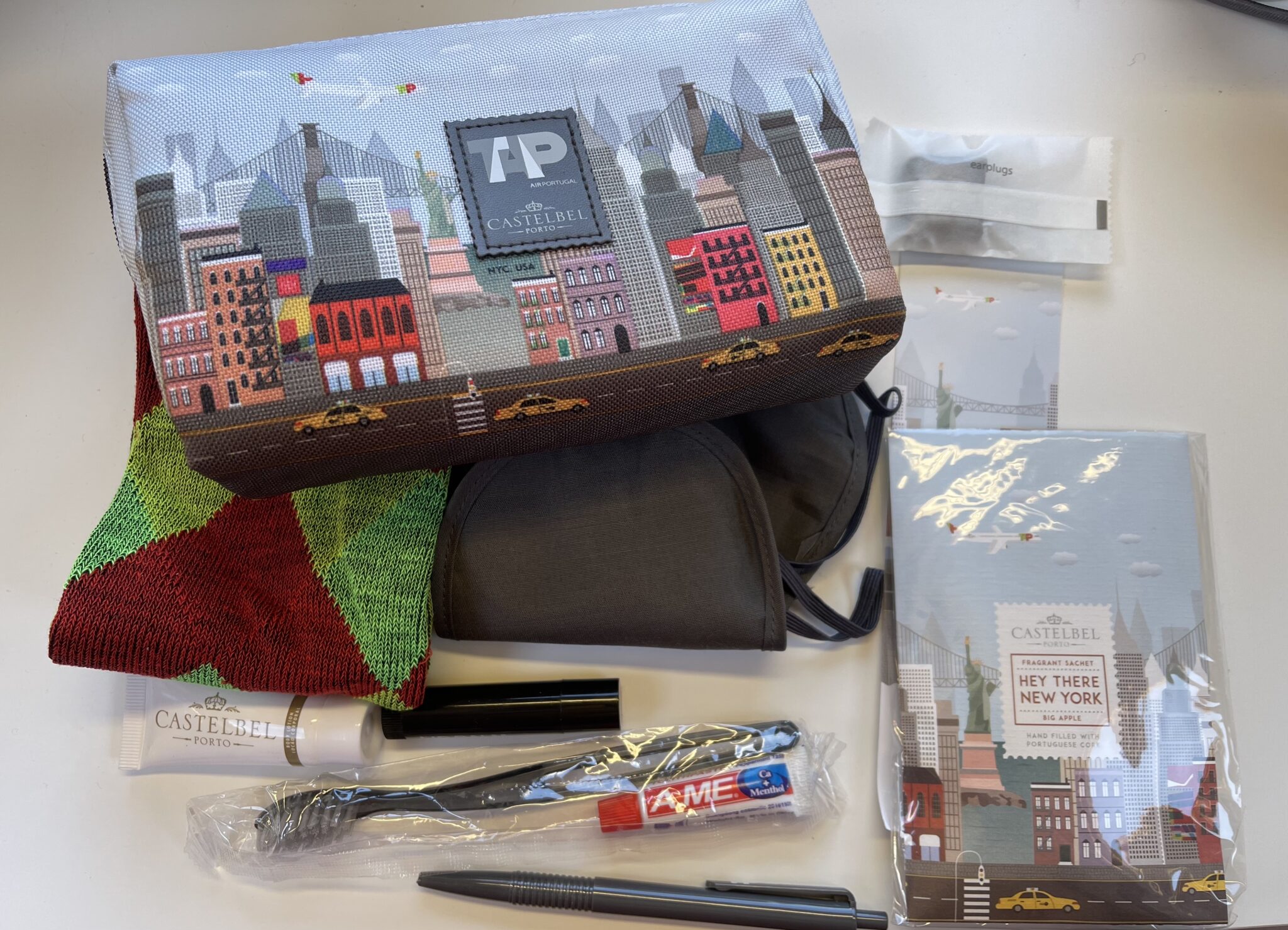
The most immediately striking on sitting down on a longhaul flight in business is the charming amenity kit, which will be one of a series featuring designs that represent some of the world’s great skylines across the TAP network: New York, Washington, San Francisco, Berlin, Rome, Barcelona and so on.
On a recent Miami flight, the New York bag was on offer, and all are cobranded with Castelbel, the Porto-based soapmaker turned fragrance house.
As well as the cute cartoon cityscape design on the bags themselves, they feature a very pleasant Castelbel-branded hand lotion as well as a unique, off-the-aircraft present: a small fragrant sachet of Portuguese cork, with a custom scent for each city that both perfumes the amenity kit and can be used after the flight.
TAP suggests that you use these to freshen up your suitcase, and indeed the Big Apple scent in our New York kits was sweet and floral without being sickly, and freshened up our luggage nicely.
Even as your author writes this, the Big Apple Scent is still wafting from the amenity kit. Image: John Walton
There’s also a cheery, relatively premium pair of socks with a kind of argyll pattern in the TAP house colours, plus rather more pedestrian items in grey, including a pen, comb, lip balm and eye mask.

In normal, non-pandemic times, one imagines that the next encounter would be with TAP’s delicious Portuguese wines for a pre-departure beverage, but this had to wait until the first onboard service trolley rolled down the aisle after takeoff on both flights, taken in January 2022.
Here, though, were exciting Portuguese novelties to explore. Yes, of course you could try a glass of ten year old Graham’s tawny port, but there was also a fresh Portuguese sparkling wine, plus two whites (including a very moreish vinho verde) and two reds. The crew were only too excited to make recommendations, and showed genuine pride in being able to showcase Portugal to passengers.
Options included local beers, Portuguese gin and delicious liqueurs little-known outside Portugal, including the liquoricey Beirão and deliciously tart sour cherry liqueur Ginja Mariquinhas — which went very well as a sort of kir royale, mixed with the Portuguese fizz.
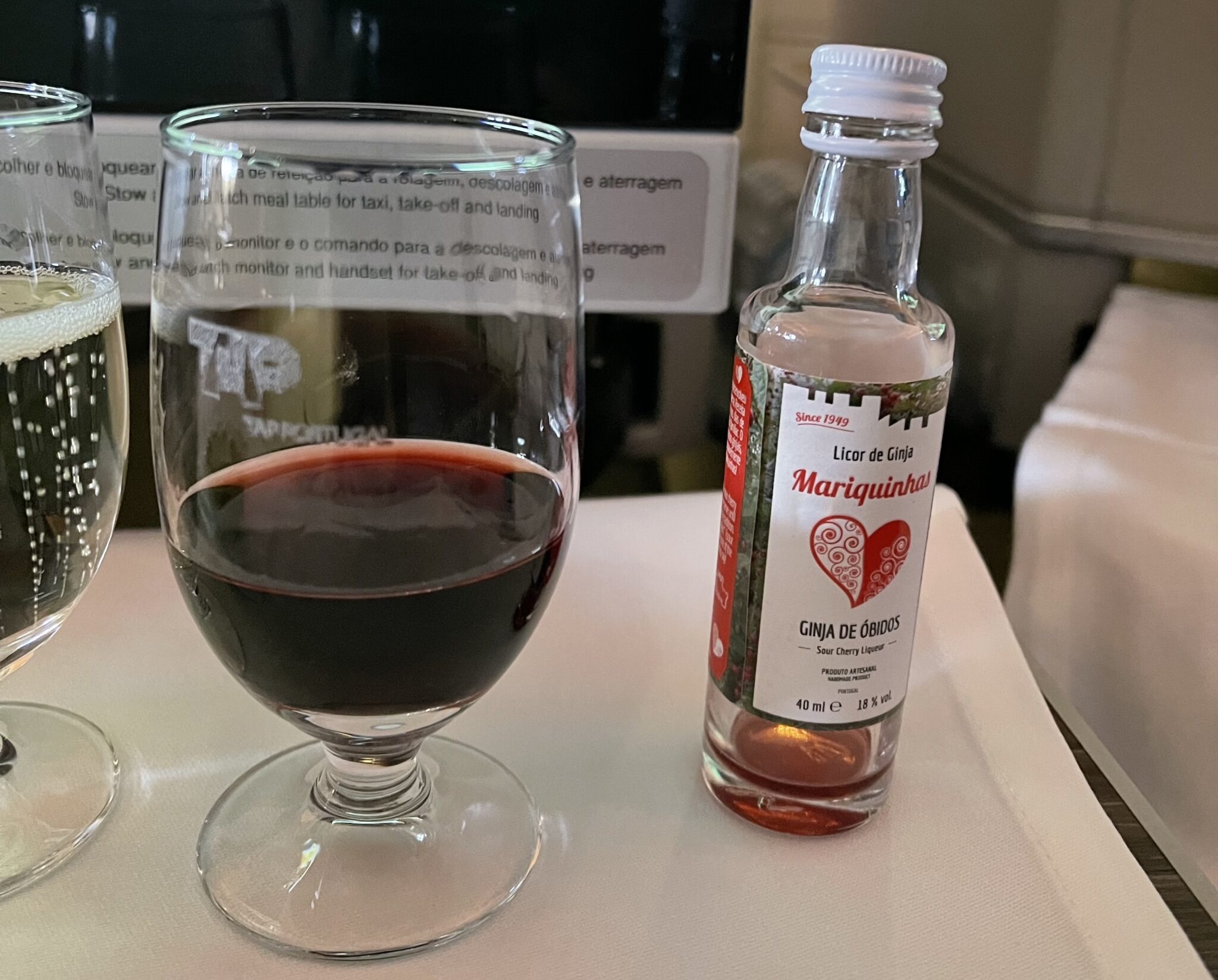
The cherry liqueur was delicious on its own but even more so in a glass of local fizz. Image: John Walton
After-dinner drinks included more port and a deep golden Moscatel dessert wine that went down a real treat. All in all, it’s hard to recall a more well stocked, cleverly designed and locally focussed drinks cart rolling down an aisle, and TAP is to be praised here.
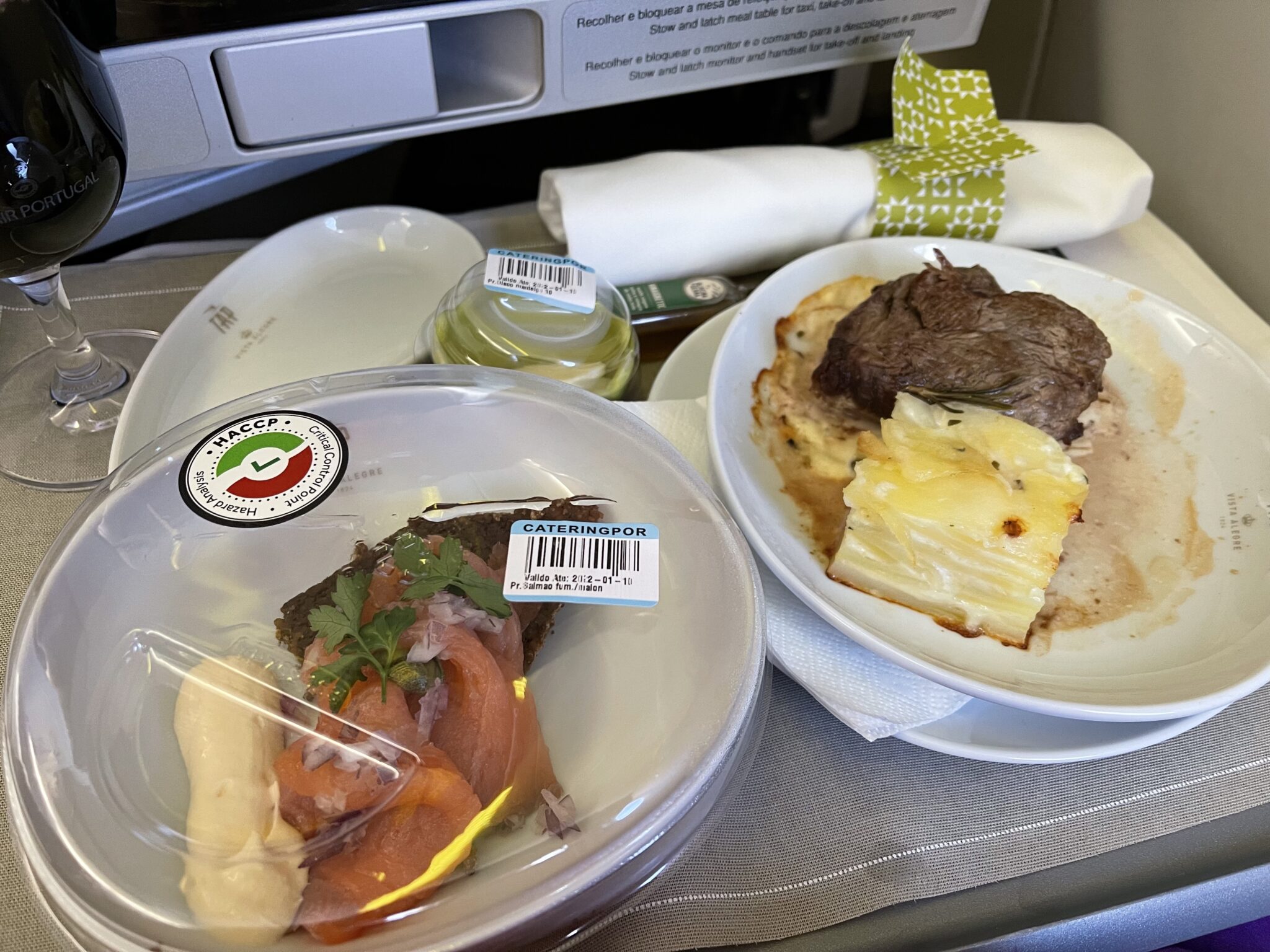
Also up for praise: the stemware. TAP offers both the usual airline-sized smaller stemmed glasses for options like liqueurs, and higher tumblers for water and juice, but for its wines it offers a larger glass reminiscent of the kind of stemware seen at tastings or wine festivals. (The IFE suggested this was a newer addition to the range as part of the wine showcasing.) This highlights the wines, and indeed makes the whole experience feel substantially more premium.
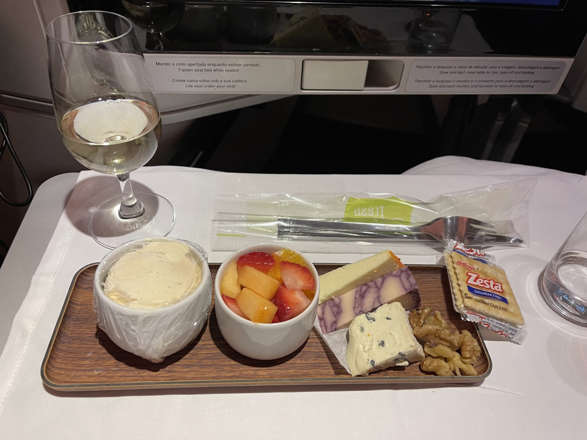
TAP’s larger wineglass and the wooden dessert charger are pleasing additions to the #PaxEx. Image: John Walton
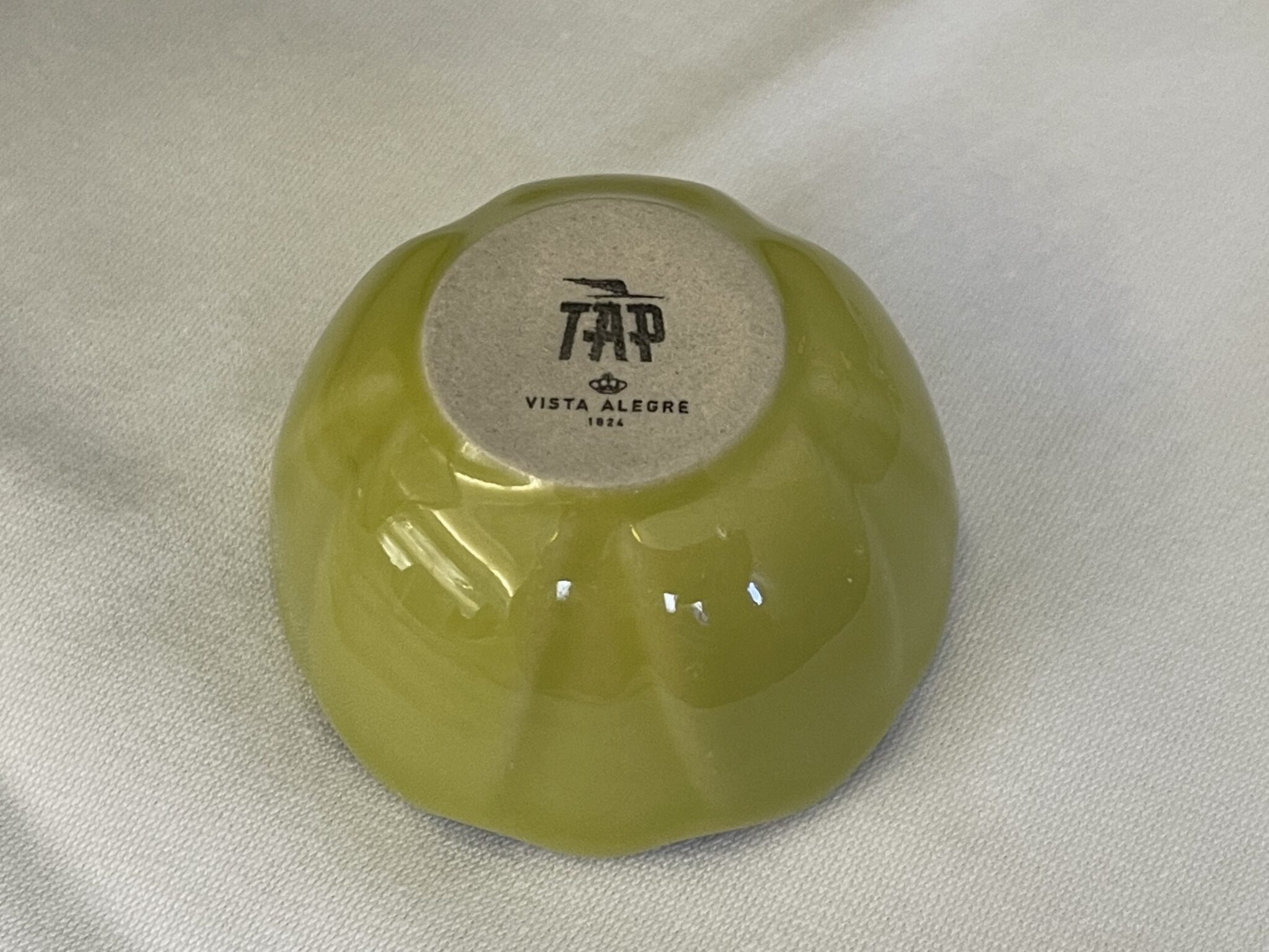
On to the crockery, which is co-branded and co-designed with the Portuguese porcelain house Vista Alegre, which dates back to 1824.
The co-designed Vista Alegre dinnerware comes in a variety of forms. Image: John Walton
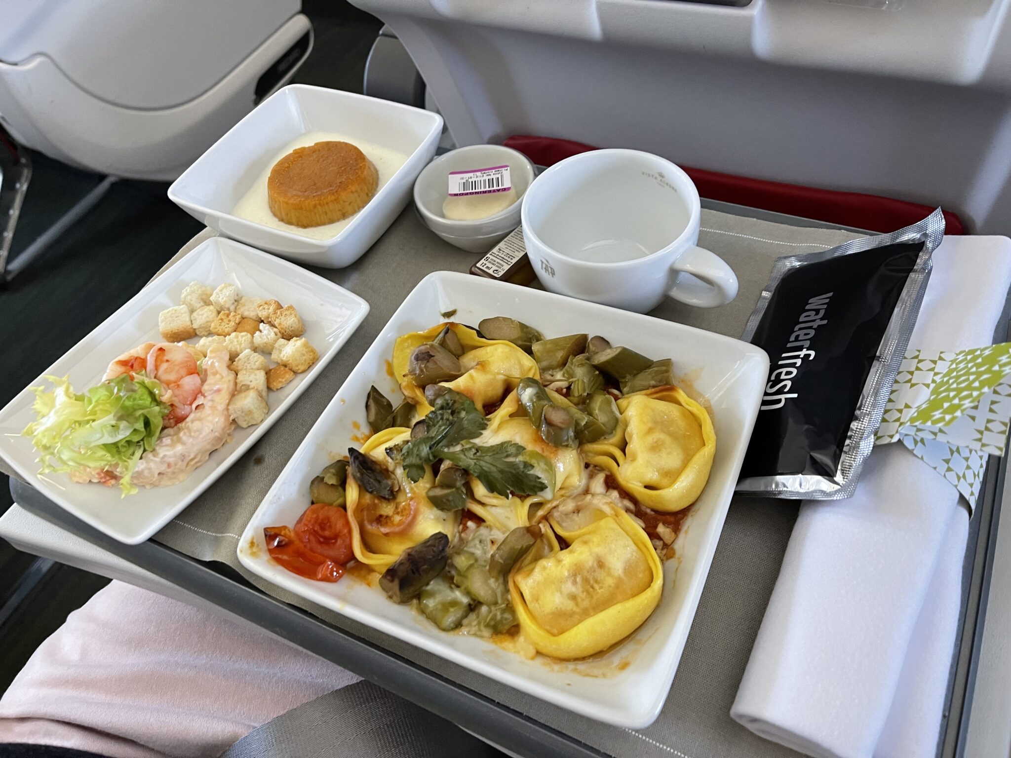
These include a charming little petal-inspired nut bowl in a TAP green, which makes a second appearance in the service as the butter dish. It’s a pop of colour on the tray and is one of those little details that shows real design thought.
TAP’s little nut bowl makes an appearance at other points in the service too. Image: John Walton
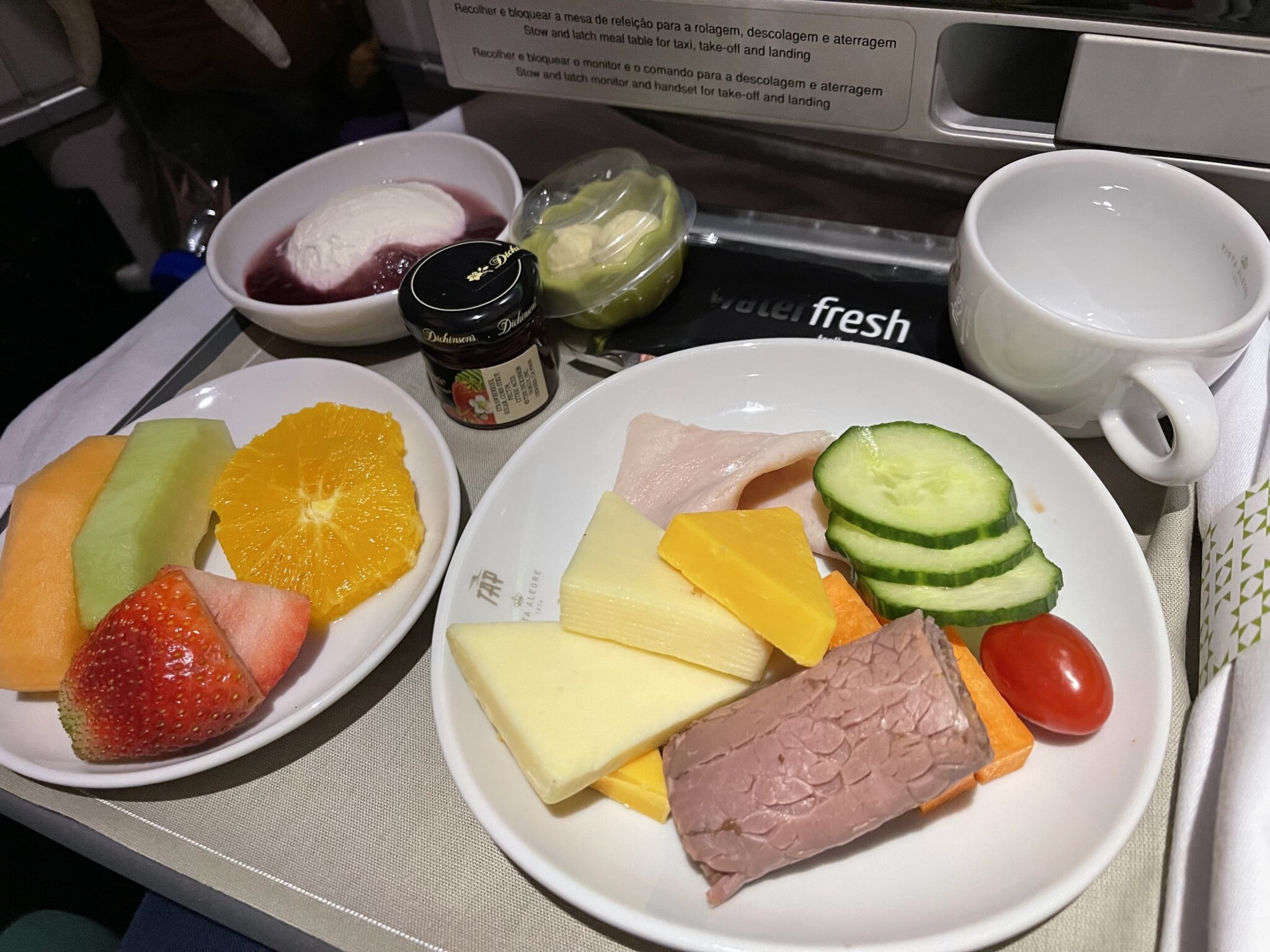
Longhaul plates, bowls and dishes are all cobranded, with an attractive modern rounded square style for the main dishes, plus a rounded triangular bread plate. (On shorthaul, where space is at a premium, the dishes are square, unbranded, and sized to fit the smaller tables, although the coffee cup retains the brand.)
In the more confined PaxEx space in Eurobusiness, the TAP branding is present on the coffee cups but not on the plates. Image: John Walton
There’s also a smart dessert concept: a wooden charger for three smaller items: a dessert, a small fruit bowl and some cheese — which was, on departure from Lisbon, a registered Portuguese AOP variety. This wooden idea has been used before (on Delta and Virgin Atlantic within the last decade at least) but it’s effective and brings some softness to the service.

The trio of desserts featured Portuguese DOP cheese out of Lisbon. Image: John Walton
Cleverly, throughout all its serviceware branding, TAP has used its vintage logo rather than its present one, which both gives a certain jet age snazz and also means that it won’t have to be replaced if the modern logo is updated or amended in the future.
All in all, for an airline that often cops flak for missing parts of its passenger experience, the design through all these small details is thoughtful, whimsical, historical, local, premium and often delightful. Kudos to TAP for making the effort here — many other airlines, including many with strong premium brands, don’t go this far.
Even where the concept and execution of the food were poor, the dinnerware shone through. Image: John Walton
Related Articles:
- TAP A321neo shorthaul business: a new standard for Eurobiz?
- TAP Portugal gives high-altitude taster of what to expect when you land
- How aviation can get inventive about flexible “third places”
- LSG’s COVID-19 food trend update asks big questions
- Rethinking the changing role of airline catering
- SIA teams with Golden Door to enhance wellness on ULR flights
Featured image credited to John Walton