 If you think early 20th century Russian art, you probably think Constructivism, the art style best popularised in the West by Kandinsky. That’s why Moscow Sheremetyevo’s new terminal is designed in the striking, often geometric style — and why JPA Design’s new pair of lounges, opening this week in advance of the football world cup, are too.
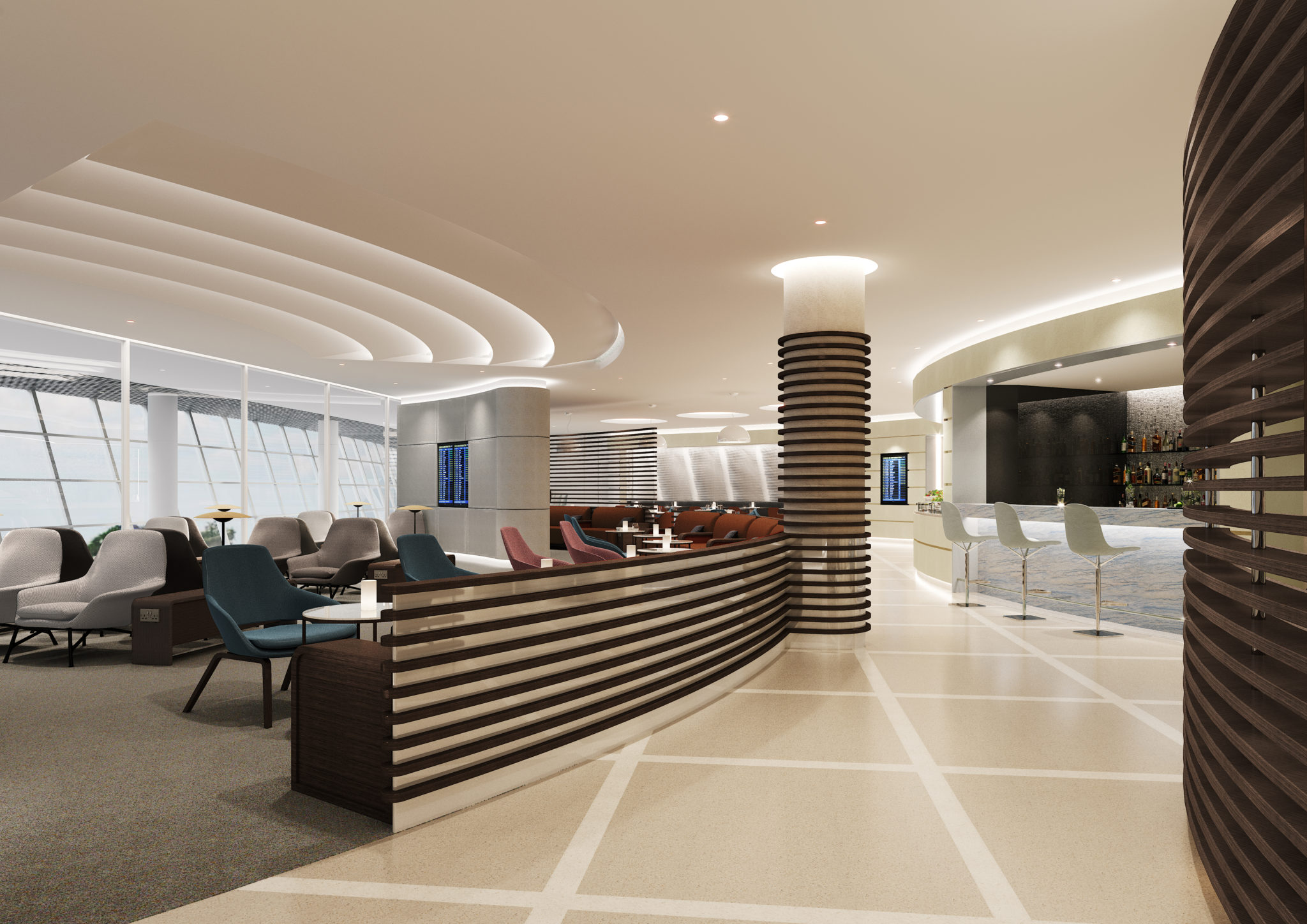
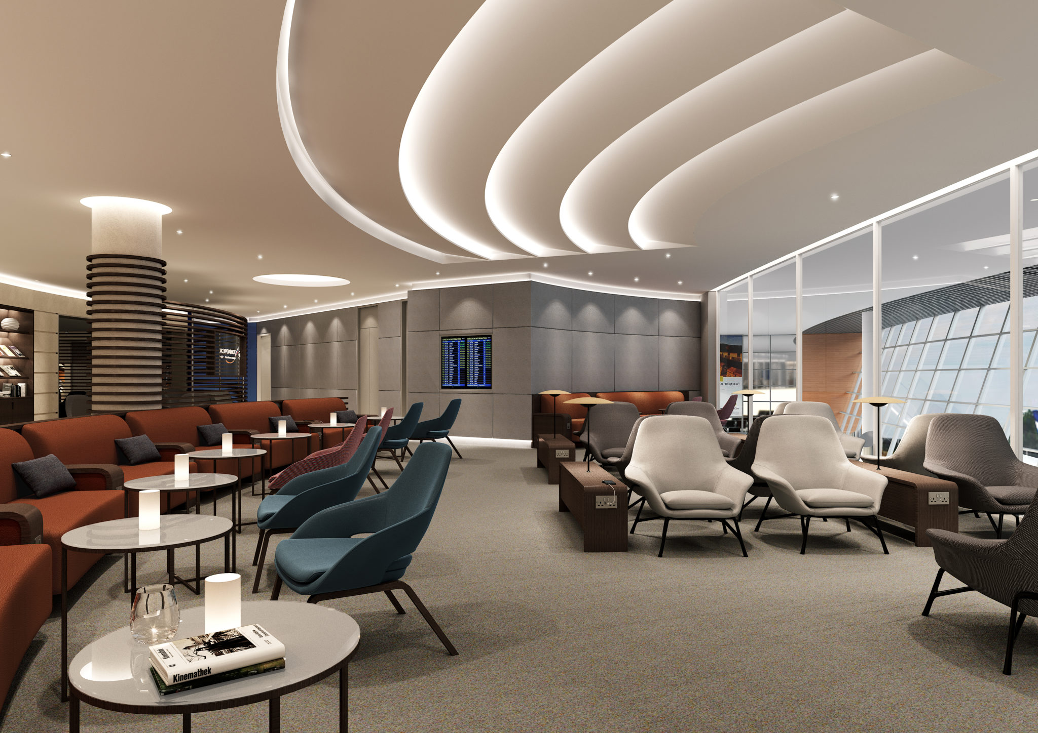
The airport-operated one of the pair is even called the Kandinsky Lounge, a 320-guest, 1.5 square kilometre facility sitting in terminal B. But fear not: it’s no Popova-style riot of colour, expressing a more Stepanova-esque set of earth tones, in what JPA Design describes as “ribbed timber ceilings with dynamic light features” and “light, neutrally coloured wood panelling, combined with vertical fins allowing veiled views between areas”.
“While the style’s basis is industrial, austere and visually powerful,” the design house says, “JPA has softened and elevated it to ensure that the interior aligns with the most discerning guests’ expectations of comfort and luxury.”
Angled light fixtures call to mind a number of Constructivist works in the welcome area, while recessed alcoves display sculptures in the library area to weave the artistic narrative throughout the lounge.
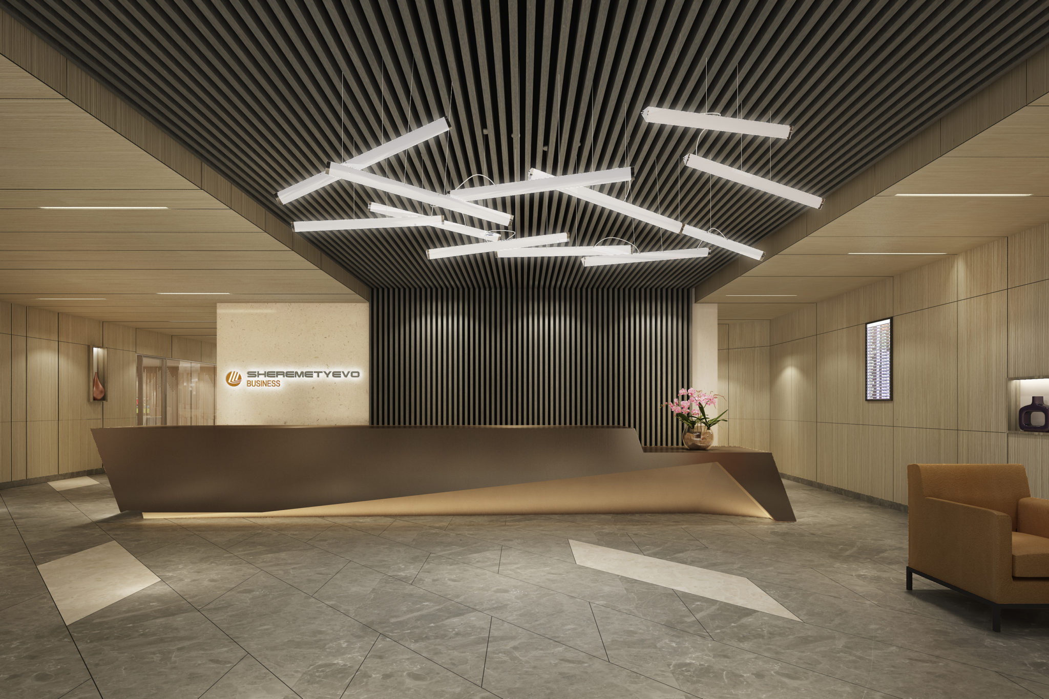
The Constructivist-inspired lights welcome passengers into the lounge, transitioning them from a starker exterior. Image: JPA Design
The lounge comes with all the mod cons that modern business class travellers expect, and I particularly like the little movable side tables in the “cybercafé” (how retro!) section.
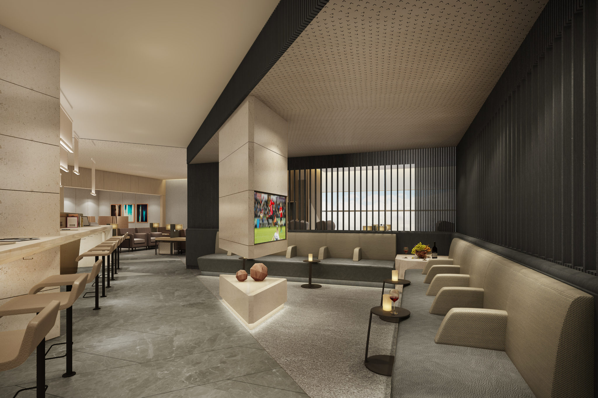
I’m very taken by those little side tables, and by the stark design of what seems like a hanging fireplace effect below the TV. Image: JPA Design
As far as airport-operated lounges go, this is certainly a win both architecturally and in terms of the facilities planned for customers, although I would have loved to have seen even a section that went full Kandinsky, perhaps with a set of prints and some explanatory bumf.
In the new Aeroflot Moscow lounge over in terminal D, by contrast, JPA has created “a modern interpretation of Moscow’s neo-classical and vernacular architecture and cultural richness”.
It’s more organic, more curved, and a little lighter, supposedly “representing the elegant movements of the city’s world-renowned ballet dancers” with continuously flowing side walls that lead through the 1.2 square kilometre space.
I even spot some power sockets along the multiple types of seating offered, though no #LoungeHolyGrail power-chairs-tables in the set of renders JPA sent along.
It’s hard, however, to find much that says “Aeroflot” here. That’s partly because the airline’s branding doesn’t provide all that much to work with (the winged hammer and sickle are a little passé), suggesting that even JPA’s designers can’t create silk purse lounges without at least a little bit more than a sow’s ear of brand equity to work with.
Yet the kind of design — and indeed architecture — JPA demonstrates in the Kandinsky lounge is truly praiseworthy, taking inspiration both from local artistic heritage and from the terminal surrounding it. It often strikes me in even some of the world’s best lounges that there is an architectural disconnect between the terminal, which is often stark, brightly lit and charitably described as industrial-chic, and the lounge, which too frequently feels like it has been designed in isolation.
For all its faults, British Airways’ set of Terminal 5 lounges fits in with its surroundings admirably well, with a countervailing aesthetic at the significantly dingier Terminal 3 — home to some of Heathrow’s best lounges, but thus an even greater disconnect from the shabby, dingy and miserable terminal that contains them.
Qatar Airways, too, does an excellent job with its home hub Doha lounges, which fit in well with the aesthetic of the surrounding terminal, even if they lack a little in actual Qatar Airways branding, particularly the Al Mourjan lounge that serves business class passengers.
It’s when lounges, terminals, cities and airlines can be combined in terms of style and passenger experience — as ANA did so cleverly with the reveal of its Honolulu lounge complex — that excellent space and user design comes through.
Image Gallery:
- The reception space is really the only Aeroflot branding in the lounge. Image: JPA Design
- The circular light features are supposed to represent St Basil’s Cathedral. Image: JPA Design
- Sitting and watching aircraft through large picture windows is always a pleasure. Image: JPA Design
- I like the multiple levels and variety of seating areas. Image: JPA Design
- The angles of the lounge harken back to Constructivism, but less starkly. Image: JPA Design
- It’s always a pleasure to see a library section, and this corridor pulls passengers through to the main lounge area. Image: JPA Design
Related Articles:
- ANA triples down on Honolulu A380s with new lounge and gate complex
- flydubai offers unique Dubai T2 business class proposition
- Fixing the dim, windowless box lounge problem
- “Bleisure”: terrible word, useful thinking concept for airline lounges
- Qatar’s Paris CDG lounge shines, with one exception
- PaxEx 2018: Airlines seek to redefine lounges during a time of transition
- How airlines can design multifunctional lounge seating to please all


