

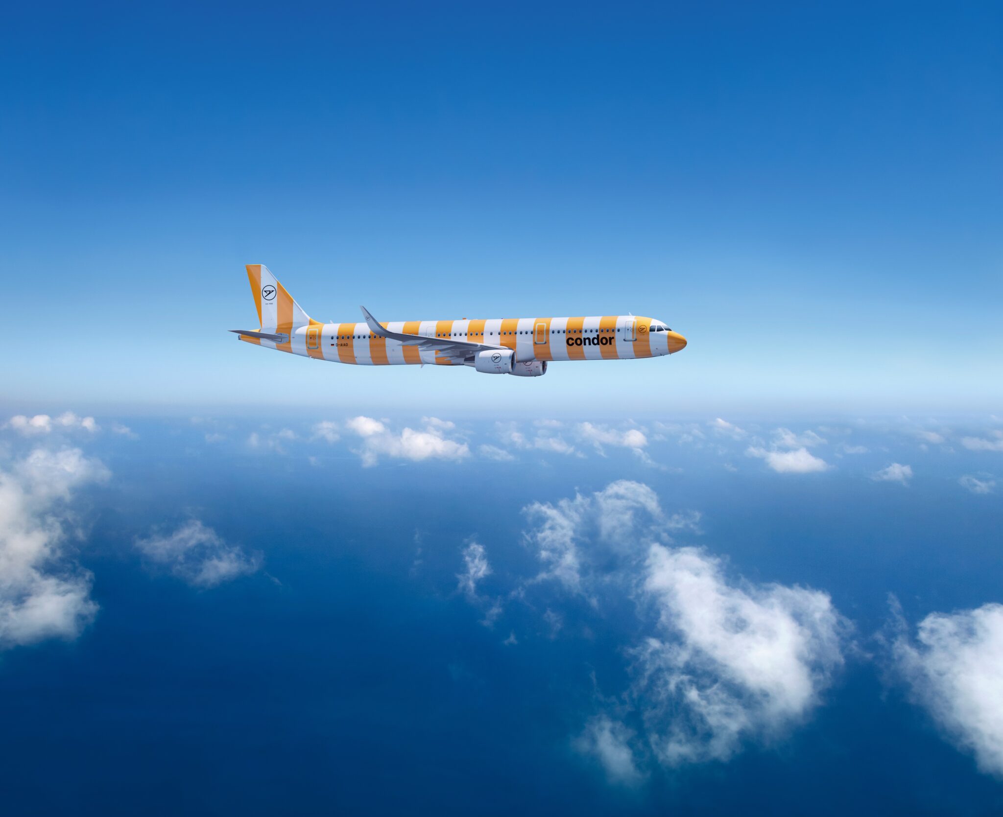
 Depending on who you ask, it’s the worst livery of all time or it’s the second coming of the golden jet age icon Braniff’s brightly coloured planes: German leisure airline Condor has certainly put the striped cat among the pigeons with its new livery.
Indeed, the clamour that Condor, or perhaps its branding and marketing agency, has engendered will be worth every penny of painting wide vertical stripes in a range of colours along the white fuselages of its aircraft.
First Condor #Airbus #A330Neo emerge from paint hall this morning. 🇩🇪 #Germany #AvGeek #Toulouse pic.twitter.com/rF8MT9NzlT
— Aviation Toulouse (@Frenchpainter) April 4, 2022
Every take on this livery is going to be different, naturally. Considering pure avgeek aesthetics, it’s a grand departure from the grey-and-gold Thomas Cook-era Condor livery, or the Eurowhite of most competitors, or even Condor’s classic retrojet, which is certainly a popular heritage throwback. But, speaking as a journalist who has spent many an hour photographing airline liveries, we are not the market that Condor is hoping to attract for its holiday flights.
From a branding perspective, the livery is part of a rebrand of what was a bit of a stodgy oldschool bucket-and-spade charter airline of the past into a much more modern airline.

Indeed, “Vacations are striped. And Condor is vacation,” says the airline, citing striped umbrellas, beach towels and ice cream shops. Interestingly enough linguistically, the German is swapped around in the singular: Condor ist Urlaub – Und Urlaub ist gestreift, or “Condor is vacation, and vacation is striped”.
(Insert here the classic cliché from British readers of German holidaymakers getting up at the crack of dawn to drape their stripey towels over the very best deckchairs at the holiday pool, often to fail to actually occupy the chairs for the best part of the day — the scandal!)
From a passenger perspective, this bright new brand is sure to catch eyes — whether you personally, dear reader, think it is scandalous, fabulous or both.
It’s fascinating to watch at the gate whenever some sort of special liveried aircraft pulls up, to see small children (and indeed some adults) gravitating towards the windows.
One can almost hear the excited little voices exclaiming “Mummy, look, it’s our stripey plane!”, or whatever that is in several fewer but much longer German words.
More importantly, one can almost hear them saying next year, “Mummy, when are we going on the stripey plane again?”.
At a time when there is more competition in the holiday market than ever before, with full-service airlines punching down and low-cost, charter and leisure airlines multiplying and diversifying, a standout branding — even if it might feel a bit eyewatering for the few minutes you look at it at the airport — is an asset.

All that said, to your author, the livery does have a few practical design flaws. It is more successful in the shiny computer renderings than in the flesh, and in some colours than others, mainly in that the actual Condor wordmark is in black and is legible on the lighter colours. The bright Condor Sunshine orange and the pale Condor Beach beige work well
Und da ist auch schon unsere nächste #Schönheit. 🤩 Frisch vom @MaastrichtAachenAirport eingeflogen erstrahlt unsere #A321 nun in neuem gelben Streifen-Look. ✈️
Wer unseren #Livestream mit verfolgt hat konnte sie schon aus ganzer Nähe bewundern. pic.twitter.com/cAlwkHZBnh
— Condor Airlines News (@Condor) April 4, 2022
But in a dimmer reality, the Condor Island green on the A330neo can read as if the airline name is “c d”, the bold Condor Passion red on the 757 ends up as “nd”, and the Condor Sea medium blue on the A320 looks like “on”.

In a German winter, or even on a cloudy northern European day in other seasons, Condor can’t rely on the bright spring sunshine in the south of France to make its colours pop enough for to the brand name to be clear.

And, in a sort of branding equation, vacation may be stripes, but stripes don’t yet equal Condor in the mind of everyone.
Would these have perhaps worked better if Condor Sea was more of a lighter, Condor Sky blue? Or if Condor Island green was more of a tropical sea turquoise? What about perhaps leaving one stripe off to allow the wordmark to breathe? Splitting the “con” and the “dor” across two white stripes? Or even turning the wordmark up on its side on one of the white stripes for a vertical approach and better visibility?
These might be hair-splitting questions. But what your author comes back to when thinking about this livery is the ear-splitting grin when first seeing the bright green rendering in a photograph in the French sunshine. This new livery is bonkers. But it’s delightful.

Related Articles:
- Teague on creating Alaska Airlines’ unique Orca splash
- Behind the Livery: A talk with JetBlue graphic designer Ciara Cordasco
- Think pink: Airlines delight with lively livery colors
- Condor uses small touches to improve holiday PaxEx
- Press Release: A new colourful livery for Icelandair
All images credited to Condor