
 Think back to your last flight. You walked through the busy airport, down the jetway, or up the aircraft stairs. You entered the aircraft, turn right (or infrequently left), find your seat, and the clock starts: the airline has just about thirty seconds to impress you.
Did it do so on that flight? Did the seat and its environment look welcoming, comfortable, interesting, and attractive? Or was it bland, blue-grey, poorly lit, and generic? If it was on a low-cost carrier, did it look cheap and cheerful, or cheap and nasty? If it was a full-service airline, did it look and feel premium, distinctive, or stylish? Did it meet the design, branding and experience expectations that the airline set for you in its advertising, booking process, and the #PaxEx so far?
In economy and premium economy, the first impression we see is often set by the lighting. This doesn’t necessarily have to be the very latest in programmable lighting along the lines of that used by Finnair or Icelandair or Philippine Airlines. But it should at the very least be something more than the bright stark white that so many airlines still use, or the tired dim beige that screams thirty-year-old aircraft.

Light-colored neutrals aren’t necessarily a problem if they can be coloured by light. Image: John Walton
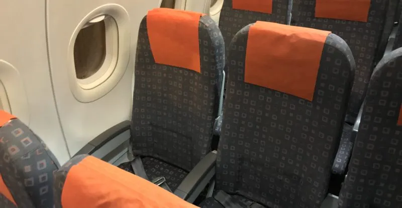
The seat fabric used is also key, and it’s a shame that so few airlines make the most of it. After all, it’s practically invisible once passengers are sitting on it, but there’s an opportunity for real fun and differentiation on first sight. Does it break up the serried ranks of seats? Does it catch the lighting, and does it harken back to the airline’s brand? Or is it row after row of dark blue or grey material that could belong to dozens of airlines?
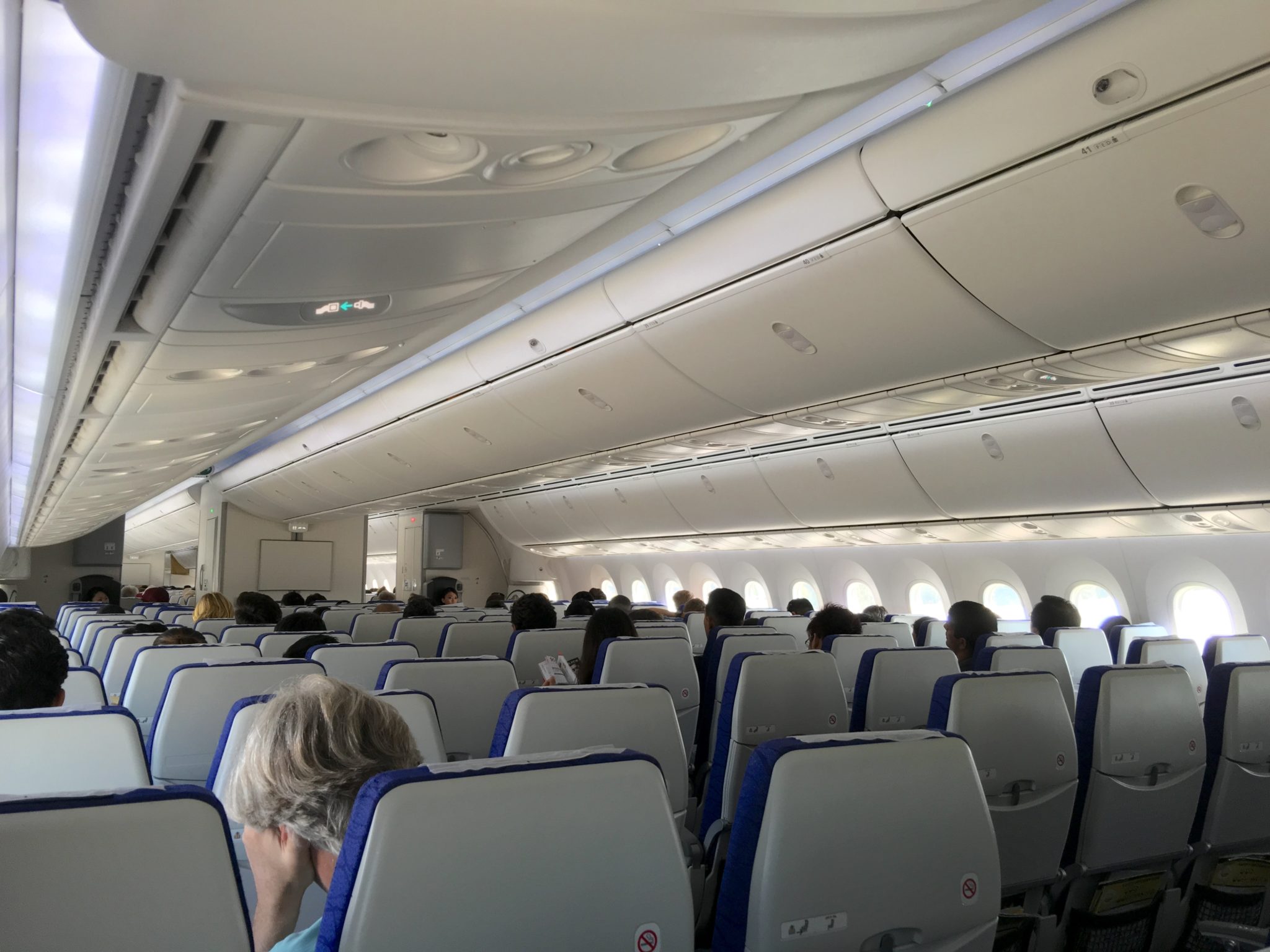
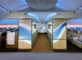
Could you name this airline from the cabin design? If not, does that create a problem for a carrier like Scoot? Image: John Walton
All of those factors from economy are relevant in business and first class too, of course, where passengers paying premium fares are increasingly expecting a premium look and feel. But here there’s more space to work with — and correspondingly more design opportunities to grasp or to squander.

Crucially, there is the factor of in-cabin seat shells to consider up front. Walls of greige thermoplastic should sound a cautionary note unless there is thoughtful, consistent lighting that ups the interest level, and a materials choice that works with the lighting rather than against it.
Walls and cabin monuments, too, are growing in importance, as is the work done by companies like ABC International alongside design houses to brand cabins and give them a premium feel.
Increasingly, the thought given to how the soft product for a flight is presented is a shibboleth for good design and good passenger experience in business class.
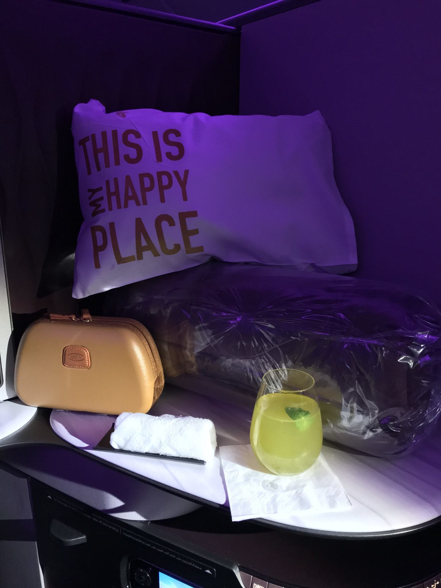
How are the blankets, pillows, duvets, mattress pads, amenity kits, headphones slippers and other items presented? Are they squeezed into a shrink-wrapped plastic bag and shoved into the footwell? Do you end up with so much plastic wrapping to throw away that you wince in guilt for the future of the planet? Are the seat and side-table surfaces so covered with bits and bobs that you can’t put your hand luggage down to pull out the few things you need for takeoff and landing?
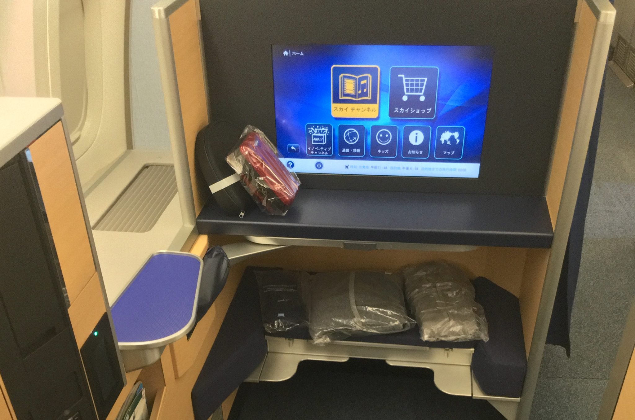
Just how much plastic wrapping is truly required of soft product? Image: John Walton
Or have the headphones been discreetly hung on their special hook, the slippers slipped into the magazine rack, the amenity kit positioned attractively, the pillows arranged to look plump and inviting, the duvets tucked out of the way, the mattress pads stored overhead until it’s bedtime?
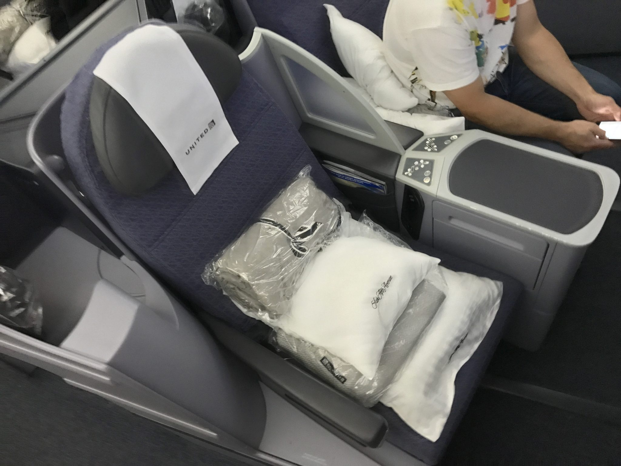
A legitimate question for passengers – just where do you put all that stuff? Image: John Walton
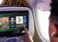
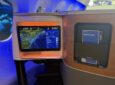
Once you’re seated, is the screen on and showing something attractive, informative, fun, or otherwise eye-catching? Is what you’re looking at interesting or swanky enough to take a quick snapshot for your family and friends on social media? Or are you staring at a featureless seatback and a dark screen?
Is what you see when you sit down worthy of a snap with your cameraphone? Image: John Walton
There’s a strange mirror dichotomy between designing for a first impression looking down at a seat and, by contrast, for the fact that passengers might be looking at the other side of that seat for nearly twenty-four hours. Getting it right — designing a seat that does both well — takes a long time and much expertise.
Related Articles:
- Towards designing Instagram-worthy modern premium PaxEx
- Italy’s ABC International takes cabin branding to the next level
- Is the future of seatback thermoplastics really greige?
- Finnair’s London A350 is a refreshing change from Eurobusiness norm
- Lift explores cabin lighting as a brand canvas and revenue stream
- Better flight in amber: is it time to bring warmth back to cabin colors?
- Gulf Air gets to the heart of identity with rebranding effort
- Cabin designers lavish praise on new airframer-branded cabins