

With mobile boarding passes becoming more prevalent, and yet few user interface developments being made as airlines and their designers learn more about how passengers use them, it’s high time that standardisation, design principles and user experience are taken into consideration for the wide range of passengers who use their phones instead of pieces of paper.
RGN spoke with graphic designer Jessica Demmer-Knight in Melbourne and user experience specialist FJ van Wingerde in London to delve into the principles behind this kind of design, and to talk about what airlines can do to improve the passenger experience.
“Travelers will mostly be glancing at these boarding passes while they are physically distracted by their luggage and their unfamiliar environment, visually distracted by competing signage in their surroundings including commerce, and aurally distracted by ubiquitous pages, prompts, and announcements which they know they should listen to,” van Wingerde says. “If passengers are also in transit, they will be dehydrated, tired, and perhaps a little impaired from any liquid courage against flight jitters they may have imbibed. As a specialist in user experience I have to basically assume that quite frequently the user of these passes is the functional equivalent of slightly drunk. They might not actually be drunk, but they are so assaulted by everything they might as well be.”

“And from that point of view,” van Wingerde notes, “I am not very disappointed, but also not impressed. The organising principle for a digital artifact like this is to make important things more prominent and less important things less prominent, and we call that ‘creating the Information Hierarchy’. This is usually a really hard thing to do because it requires lots of research to find out what people exactly need when, and doing that for a group as generalised as airline travelers in airports all over the world is very hard.”
However, van Wingerde continues, “the designers of the format of these cards seem to have punted on this task: there are really only three levels of hierarchy. 1. Top line visible in a stack, 2. The big airport call signs, 3. Everything else below that. And that’s just going to make travelers have to scan multiple times at different points. Some aspects of the hierarchy are even puzzling on second thought: why is the destination airport so prominent, considering you know where you are going? How often does someone really look at their boarding pass in an airport and exclaim “Oh my god, I am going to Zurich?!” I’m not saying the destination should not be on the pass, but I do wonder about its prominence.”
Graphic designer Jessica Demmer-Knight concurs. “There seems to be a lot of real estate given to the arrival and departure airports. I feel like most passengers would know where they are travelling! This is about the only consistency between all of the mobile boarding passes I have looked at. How many people travel so often that they require this information first and foremost?”
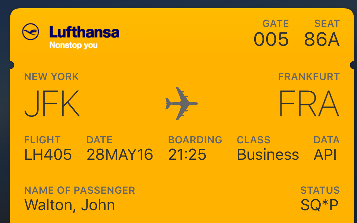
“Why does this ‘data’ field need to be here?” Demmer-Knight asks. Image: John Walton
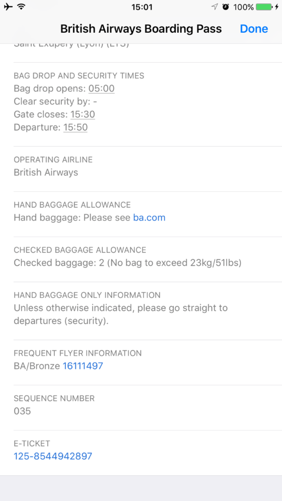
Meanwhile, the activity one does most in an airport is try to find your gate based on time of departure and flight number, and yet the flight number – which is hard to memorise for the casual traveler but is very vital – is actually rendered in a smaller size. “Only some airlines put the flight number in the top spot such that you can see it in the stack of Passport cards without having to open the card itself, while other airlines make you hunt for it but putting it at the third level, which means you may be opening the card over and over,” notes van Wingerde.

Singapore Airlines is praised for including the date in the top tab section. Image: John Walton
Demmer-Knight believes the most sensible standardisation should be based on what is visible in the wallet view, on the top tab of the passes. “I feel like a lot of airlines haven’t thought deeply about what will be the most import information for their passengers. Their mobile boarding passes really need to mirror the passenger experience their customers have navigating the airport, from check in to their seat,” she says.
“The most important thing in design is hierarchy of information. What do people need to know first? What is most important? This should be the most prominent thing visible. You then rank the rest of information by importance and give it corresponding visual weight. The point of design is to make life easier, by giving the audience what they need to know in the right order, by importance. Form comes from function. The best design is elegant because it offers exactly what is required in an easy to navigate format.”
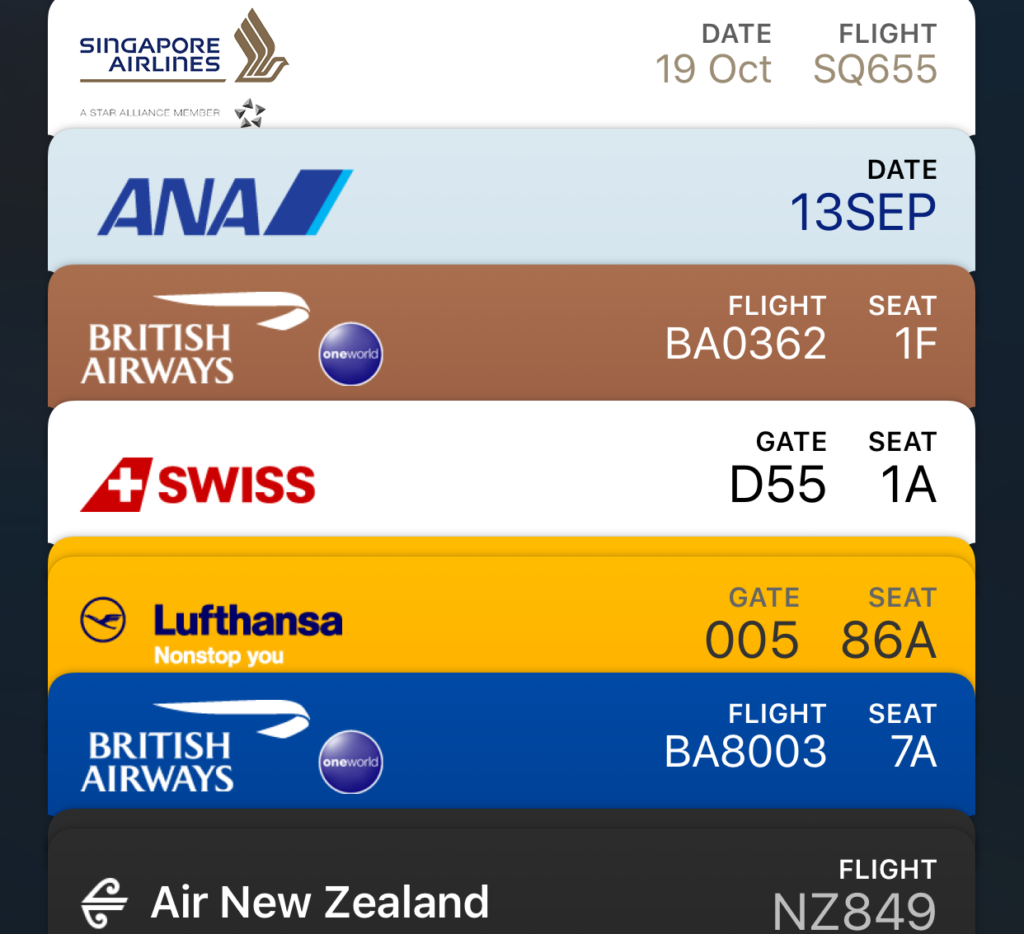
Both Demmer-Knight and van Wingerde raise questions about what information needs to be in this tabbed stack view. Image: John Walton
But what if the information hierarchy changed with the circumstances of the user’s journey? This is “something that digital experiences can easily do yet is vastly under-explored,” suggests van Wingerde.
“An example would be showing the time and departing airport most prominently during those hours that the traveler is probably haggling front desks and taxis and trains to get to the right airport on time, and make everything else secondary. If then the pass was smart enough to know the traveler is at the airport and then update itself to make the flight number most prominent outside of security, and the gate most prominent closer to departure, and the seat most prominent 30 minutes before boarding, the digital experience would be usefully molding itself to the passenger’s circumstances like everyone should expect modern digital systems to do.”
“Timing info would be helpful to a less experienced traveler,” says Demmer Knight. Image: John Walton
And yet, van Wingerde sums up, “mobile boarding passes are super convenient because humans are better at keeping track of their phones they use all the time than keeping track of specialised bits of papers they only use three times a year, and as an infrequent but regular traveler I am grateful for one more simplification in my travel life.”
Related Articles: