If you’re the type of traveler to arrive at the airport with hours to spare, walk casually to your gate, know the Sbarro menu by heart and like to catch a quick nap before boarding, congratulations. For many among the rest of us, however, air travel is something of a panic, a reason to pop another xanax or ramipril while pretending to read a magazine near the jetway door. The last thing we need is a boarding pass that requires a translator.
There’s a lot of information on those passes, all sort of tossed on there, stuff you don’t really need to know, but…there it is, littering the surface. In the search for your gate number, departure time and seat assignment, you’ll stumble over a crowd of capital letters, numbers and glyphs, all in the same font size, awkwardly spaced and trying their best to confuse the hell out of you. Not surprisingly, this wasn’t made by a thinking, design-conscious person. This was created by a computer for another computer to read.
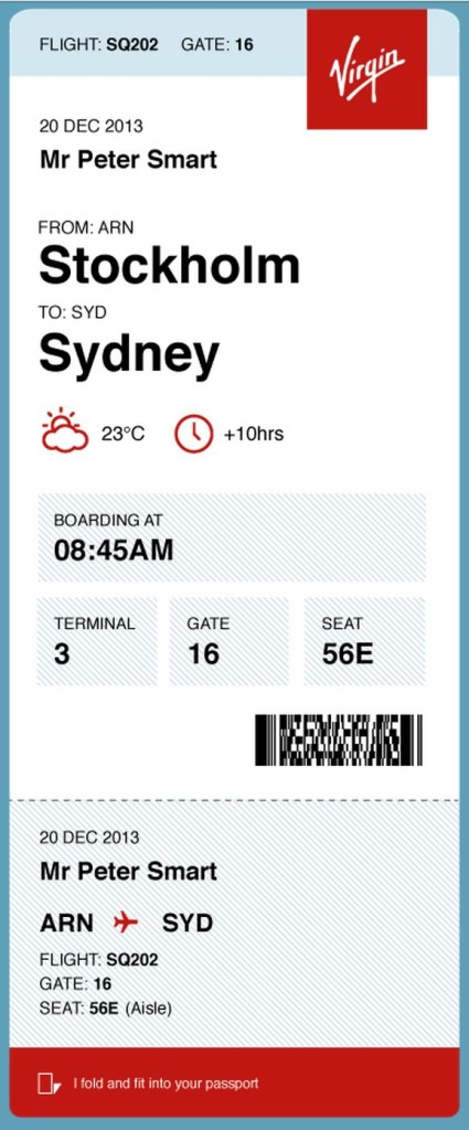
 Pete Smart is looking to clear that up. The British designer recently unveiled a streamlined version of a boarding pass that simplifies the ticket, making it more functional and friendly to the eyes.
Famous for his online quest to solve 50 Problems in 50 Days, Smart began tinkering with the boarding pass design after turning his critical eye to a Lufthansa ticket, riddled with nonsensical information that obscured its very purpose. In the stress of navigating an airport, he decided, it’s a terrible idea to further confuse passengers. Why not make the pass easy to read, with all pertinent info displayed big, bold and yes, even beautifully?
Based on now-dusty technology that utilized awkwardly-sized punch cards (seriously, what year is this?), the boarding pass has befuddled countless travelers through the years, slipping out of passport booklets when its information is checked and rechecked by anxious fliers.
Smart’s proposed makeover would still use the single color print tickets in use today, needing no transition from current machinery, but rearrange its content so it can stay securely inside a passport book, with a portrait-oriented layout that puts all the most-needed info at the top of the ticket, instead of the traditional landscape design that’s most “easily” referenced by flipping open your passport.
Integrated into the design is a sensible hierarchy of info, starting with your flight number, gate, and airline. Next, the date of the flight, traveler’s name, departure and arrival cities are displayed in large Helvetica type, with additional helpful information like the current temperature, weather and time difference of your arrival city. All those fiddly numbers and letters that corrupt current boarding passes are tucked into the bar code, letting the computer see what it needs to see, and the traveler to see what she needs.
Other designers have tackled this same problem in the last few years, including Alex Chen and Tyler Thompson, though Smart has taken the simplification even further. This of course raises the question, could they simplify further still, and finally migrate to a fully paperless reality through mobile boarding?
Recently, the FDA has called for a retooling of the nutrition labels, making them easier to read and understand. Likewise, websites have become more user-friendly, newspapers and magazines arranged to quickly engage the reader. Instead of fumbling for what we really want to know, we’re shown the highlights and important points so we can get back to rushing through our day. And really, anytime there’s an opportunity to reexamine something taken for granted, the mundane, to ask questions and simplify a process, it makes for a stronger experience with less hassle. Something air travel could surely use.
About the author, Clayton Margerum:
 Clayton Margerum is a copywriter from Lancaster, Pennsylvania, who dabbles in songwriting, whiskey tasting, breakfast making and raising four boys (though not necessarily in that order). He also hopes there is no height restriction on space tourism.


